Tuesday 28 February 2012

149. POWERLESS STRUCTURES by ELMGREEN AND DRAGSET

 Trafalgar Square - Fourth Plinth

You do not turn up at Trafalgar Square for a bit of peace and quiet. On Sunday morning the square was preparing to celebrate Maslenitsa, the Russian way of welcoming  spring. A band was tuning up in a marquee and around the perimeter were dozens of temporary cafes (‘kiosks’ would not do them justice). At the foot of the National Gallery were small covered stalls selling anything from carved toys to language books to hand-crafted clothing. In contrast, in one corner was a tightly-packed ring of Asian Christians with Bibles and prayer books, preparing to worship or evangelise or both. Around us were people climbing the lions, sunbathing, snacking, taking pictures...

It's hard to like ‘a euro-child in shorts on an Ikea flat-pack toy’ says Laura Cumming in the Guardian. Amen to that.
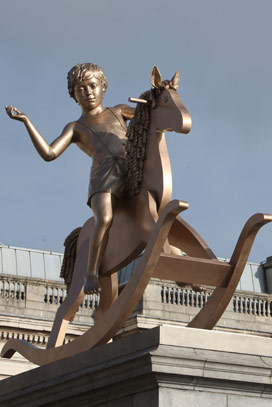
 I did not notice many raising their heads to look up at the newcomer on the block. Had they done so they’d have seen Powerless Structures, Fig. 101., a 4.1m high golden bronze sculpture of a boy astride his rocking horse. It has replaced Shonibare’s Ship-in-a-Bottle. (I have heard no news yet as to whether or not that was rescued).

A critic who likes the newcomer – Alistair Sooke in The Daily Telegraph – says Powerless Structures is 'a strong and simple idea that people will 'get' in an instant, almost as quickly as it will make them smile’. And the smile will be  even broader for those in the know. The plinth itself,  built in 1841, was designed for a bronze equestrian statue of King William IV which was never installed.  So 171 years later we have an anonymous boy, not a king. and a toy horse, not a magnificent charger. The joke is at the expense of all those statues the streets of Europe have harboured for centuries, dating back to Roman times:  bronze statues of emperors, kings, generals on horseback, often with the same commanding wave of the hand. We’re making fun of our past pretencion's as conquerors and heroes. Here is a boy who is, according to Alistair Sooke 'Nude aside from a pair of skimpy shorts held up by braces (lederhosen? hot-pants?), (with) a camp insouciance that only enhances the work’s cheeky message'.

And the horse is glum and toothless. It looks as though it has been made of cheap wood, then spray painted. Its mane and tail are in ringlets which hang down  in straight rows like fat sausages. It's an out-of-date toy, only seen in the nurseries of the rich and now relegated to decorating  Christmas cards or being a prop in The Nutcracker ballet. 

So far so good if you want irony. But shouldn't there be more?  Joy perhaps?  Couldn't the boy look  a little animated as he imagines  chasing the baddies out of town or surging into battle against rows of tin soldiers?   And why a boy when almost all public figurative statues are of males? Why not have a girl on horseback? Better still, to be inclusive, a girl with a boy as pillion passenger? With the breeze flowing through their hair and a look of engagement and fun. 

The idea of using such a plinth in such a prominent place to draw a line under our regard for past male-only  militaristic leaders is refreshing. So too is having a sculpture which contrasts with some of the more tortured or layered works which have occupied the space in the past few years.  But is it an opportunity missed in favour of an in-joke and the less-than-universal appeal of the boy or the horse? 


london.gov.uk/fourthplinth
guardian.co.uk/artanddesign/2012/feb/26
telegraph.co.uk/culture/art/art-reviews


Thursday 23 February 2012

148. PATH by EEVA KARHU

 Purdy Hicks Gallery

I had just been inside Yayoi Kusama's Infinity Room at Tate Modern (you need to pay to see this exhibition). It was too dark to see the walls or ceiling, and just possible to make out a narrow path running between still water. Thousands of tiny coloured lights flash on and off, now a vibrant pattern, now a monochrome of sapphire blue or forest green. 

Every surface is reflective. You look up and can imagine floating  into space. Step outside the path and you will plunge down, down into beauty without end. Or branch out sideways and cut a swathe through a magical forest of lights which has no limits. 

(c) artist 100 x 160cm C-Print Diasec Edition of 5
From there I walk to Purdy Hicks Gallery, on the foothills of Tate Modern, only a couple of minutes away. They're currently showing a Finnish photographer and a Japanese painter. Eeva Karhu is the photographer.

I'm facing more  delusion. A flat two dimensional area shows us a three dimensional world which does not exist. Some words from the website (which may be from the artist):


Places which you can see,
but which you can never reach.
You can select a spot in the horizon,
walk towards it,
 but when you are finally stand in that place
The horizon is already there again
Horizon (c) the artist

There are a lot of horizons and I think the person who is tired of horizons may be tired of life.. I like the way she hovers between dream and reality. 

I'm reminded of the Australian poet Les Murray's words

Everything except language 
knows the meaning of existence.
Trees, plants, rivers, time
know nothing else. They express it
moment by moment as the universe.

Even this fool of a body
lives it in part, and would
have full dignity within it
but for the ignorant freedom
of my talking mind.

You can view a fine selection of images of her work on her website.

Friday 17 February 2012

147. FLORA by PHOEBE CUMMINGS

Flora, V&A Museum, 2010 (c) Sylvain Deleu. 
Jerwood Space
Formed Thoughts 

First, don't go to see  Cummings' work without visiting  Jerwood's cafe.  You can be al fresco in the courtyard and garden, or undercover in The Glasshouse.There are art magazines to browse and staff who are a plesure to meeet.  It's a place for a family or group to meet, but also good for those times when you're alone. Time Out says of it 'CafĂ© One Seven One manages to be both minimalist and comforting, spacey and buzzing; but best of all, it manages to combine good value for money with excellent cooking'.

When artists are potters we expect their work to be studio-based and the result to be something precious and lasting. But Phoebe Cummings  explores the possibilities of clay as a raw material and contructs her pieces on site - in this case the Jerwood Space - where the work will be left to disintegrate or be broken down over the course of the exhibition. Some fragments will be preserved, some recycled, but often her pieces continue to exist only as a photograph or a memory.

Why would anyone do that? Because she wants to challenge us by collapsing familiar categories: space, material, time. When she works does the Jerwood Space itself  become an installation? Can unfired clay be temporarily lifted into an artwork before returning to be just mud? If something vanishes without trace so quickly, can it be art? The curator Claire Twomey has the interesting idea that Cumming and the two other artists in the show - Tracey Rowledge and Glithero - engage with their materials 'as co authors.’

In 2011 Cummings  was selected as artist-in-residence at the V&A , where she  researched the way landscape and nature have been represented historically through ceramic objects - in particular 19th century transfer printed tableware.There nature was idealised to satisfy those with an appetite for the picturesque and exotic. During the final week, photographer Sylvain Deleu came to the studio to document Cummings' work. One of his prints is the picture at the top.

The importance of Cummings' work was recognised the same year when she received the prestigious Spode Award, worth £10,000, during the British Ceramics Biennial at Stoke-on-Trent.

vam.ac.uk

vam.ac.uk/blogs/phoebe-cummings


.jerwoodspace.co.uk


Monday 13 February 2012

PICASSO AND BRITISH MODERN ART

Tate Britain
15 Feb to 15 July

I'm cheating here - the image is not of the art work itself but of the front of the catalogue I saw at the Press Preview this morning. The exhibition  opens on Wednesday and explores Picasso's lifelong connections with Britain.   I didn't realise that his father was a great Anglophile and that Picasso himself intended as a young man  to work to London - but got waylaid in Paris. (Or so the story goes).  The show includes a chance to see the impact he had on British Modernism in the work of seven of our best: Duncan Grant, Wyndham Lewis, Ben Nicholson, Henry Moore, Francis Bacon, Graham Sutherland and David Hockney,

I can't write about the show because you have to buy a ticket or be a member. One of my rules is that this blog is about free art. It's soemtimes a bit of a dilemma. 2012 is providing a wealth of blockbusters in London:  David Hockney at the Royal Academy, Jeremy Deller at the Hayward, Gillian Wearing at the Whitechapel, Yayoi Kusama and Damien Hirst at Tate Modern and  Ai Wei Wei and Yoko Ono at the Serpentine for a start. But  you have to pay to see them (except for the wonderful Whitechapel and Serpentine).

Of course they'll get be enormous coverage everywhere now that Great Britain is such a vibrant international art centre. And I'll be content with going to ponder some who are less well known. But one of the handouts this morning was a terrible warning to anyone rash enough to do just that. Here are three reactions to Picasso before he was seen as one of the greatest artists of all time. How wrong can you be! 

An artist's view: 'Picasso is certainly not a patch on Poulbert, or Geny, or Metivet, or Falke or Arnac, or Kern, or the amazing Laborde'   Walter Sickert, 1924

The genteel sneer: Picasso's paintings now on show at the Tate Gallery...have certainly been attracting the crowds that used to be associated with Chaplin films', The Listener 1960

And the  author: 'Senor Picasso's painting cannot be intelligently discussed in the terms used of the civilised masters...he can only be treated as crooners are treated by their devotees'. Evelyn Waugh in a letter to The Times 1945


(this is for the Hayward)


Sunday 12 February 2012

146. RADIOLARIANS FROM SCOTT'S EXPEDITION by IRENE KOPELMAN

The Challenger's Report
Gasworks

I'm walking down a narrow, well-lit street in Vauxhall. The famous gasworks, next to the Oval Cricket Ground, looms up on my left. Ahead is a small blaze of light streaming onto the pavement where I can see a cluster of smokers outside the Gasworks Gallery.

Inside it's noisy and crowded - or animated and stimulating, if you prefer. Black is worn like a uniform and everyone seems to be between 25 and 45, except for a perky toddler and a babe in arms with their brave parents. No one seems to be looking at the exhibits. Instead they're talking about them which is what I think the artist intends. Irene Kopelman is an Argentinian artist who wants us to explore the relationship between science and art.

At this point if you want something colourful and punchy to grace your walls, read no more.

The image here is Radiolarians, one of a series of large-scale paintings of microfossils brought back from the Antarctic plate following Robert Scott's ill-fated Terra Nova expedition of 1910. It depicts a spherical skeleton made of silicon, with elaborate patterns of perforations through which pseudopods extend. The remains sink to form ooze on the ocean bed and prehistoric radiolarian fossilize to become chert or flint. (This I had to look up and I hope I've got it right). One of the other exhibits is  a small case of microfossils themslves from the Natural History Museum in London. 

The Challenger's Report is Kopelman's first UK solo exhibition. She looks at how our relationship to landscape and the natural world is culturally conditioned and subject to change. She's inspired by explorers such as Ernest Shackleton which laid the foundation of modern oceanography. Her work is based on empirical research, archives and collections.  The exhibition is acompanied by events and workshops not only at Gasworks but also at the Natural History Museum.

I found myself reading about looking rather than looking. 'Surveying mountains with your eyes', she says, 'is a way of drawing' in that you scan, select, find a wafer-thin line where a narrow snowless border stands out against the sky, and watch where snow on rocks folds, converges, diverges, piles up and disappears. 'The variations of light blue and blue, one behind the other, is like a monochromatic rainbow...The peaks, cut out, wedged between other peaks, wait to become a form'.

The exhibition centres on how acts of looking are mediated by culture, invention or cicumstance. She reminds us that we carry inside our heads a treasury of multiple layers of ways of looking at nature, including our unique personal history plus our own society's taken-for-granted assumptions about things as varied as the taxonomies we use to interpret the natural world, colour categories and art history.

Tuesday 7 February 2012

145. TIME WELL SPENT by WILL MARTYR

silkscreen, archival jet ink and diamon dust print  75.5 x 75.5 cm           (c) Will Martyr-Contemporary Artists

‘In writing, I allow you to peep into my ignorance’ (Steve Connor). Writing a blog is a risk. These pictures in particular remind me of how in a post modern world, regardless of the writer’s (or artist’s ) intention, meanings are shifting, unstable and open to question.

Time Well Spent, Sweet Spot, No Need To Rush, Press Play are some of the titles of Martyr’s work, which I first saw at the London Art Fair and is now at the Hay Hill Gallery. The words strike the cheerful optimistic note we recognise from advertisements, love songs or those seductive self- improvement books.
 
And the painting themselves? Some are very beautiful – but you cannot stop there. The two works above will not hang peacefully on your walls. They are intriguing, both playful and deadly serious. They are free of all the clutter which makes life so messy – including people. Clean, elegant, empty, still and silent. Bare minimalist settings promise luxury. A colour palette puts the soft and sweet next to the raw and rampaging. We begin to check out the difference between our fantasies of the good life and what we know in our hearts makes life worth living. 

Provider is also full of ambiguities. The title promises so much, the two wings of the building stretch out like arms towards the viewer as if in an embrace. There is space and light  and colour – all the things we crave for. But is thee a hint of a cage on the left? And the lovely blue oval enclosing the building is careful not to get punctured by all these angles and sharp edges.


Martyr ‘s professional practice includes collaboration on architectural installations and he holds a teaching post at the Architectural Association. His aim is to ‘reflect the speed, lust and the glorification of burgeoning cities and explore how such forces conflict with the choices, decisions and aspirations of a democratic free society’. There will be a solo exhibition of his work at the Hay Hill later this year and in the meantime his website offers you a sight of 16 of the best.


Friday 3 February 2012

144. GEMMA by MARGOT LEMONS

Embroidery on Canvas - 80x114cm

 ArtEroticaExhibition           Cork St

Margot Lemons has given us a spiky, sensual, spunky young woman, her heel brandished in the air like a weapon, staring straight out, unfazed at being found in her undies. She's safe inside an ornate frame which seems a bit incongruous. The artist chose it 'so as to refer to the innocence and splendour of the nude image as it has appeared for centuries in portrait paintings, presenting the female form as elegant and something to covet’.
What’s also striking is the contrast between the subject and the materials of which the picture is made. For the artist has used that softest and gentlest of crafts:  delicately sewn embroidery. A craft which exemplifies genteel femininity, leisure and domesticity, a world of samplers and tablecloths, tea cosies and babies' shawls.
But there's more to come. Instead of finishing the work off neatly at the back (some teachers say the back of an embroidered piece should be as neat and perfect as the front), the threads spring out of the canvas and hang down over its surface. Most disturbing of all are the threads which the needle has poked through the pupils of the eyes and are now running straight down the front of the canvas. You almost wince to see it. But you also want to touch and to tug at those loose threads.
Gemma reminds me of Tracey Emin’s My Bed, that much-maligned art work which everyone has a view about. What links it with Gemma? Both works let everything hang out and you could say that both works are the modern visual expression of a centuries-long written tradition: confessional writing by English (and other European) young women.  By ‘confessional’ I mean honest journal-writing which gave women a chance to express something of the turmoil and energy existing inside them. It was one of the few pastimes permitted during the long wait from childhood to the moment when a woman was snapped up in marriage.
In her other works, Lemons displays a grid of different female poses taken from magazines (women's, men’s and lifestyle), as well as from portrait paintings and pornography. She  asks if the viewer can identify where each came from? She concludes that it’s not only men’s magazines which exploit women as sexual objects.

It’s cheering to find an artist asking these questions. Years ago they occupied some of us a great deal of the time. We read Erving Goffman’s Gender Advertisements and Peter Berger’s Ways of Seeing and life was never the same. Until then we hadn’t noticed that in art and advertisements women were usually depicted lying down, on a  bed or a couch (sexual availability) or on the floor (dirt, the place where you put the dish for the dogs to eat from etc..). Men never went there, but stood upright, alert. Women, when allowed to stand, were either tethered to a man or stood with their weight unevenly balanced, unstable, ready to fall over at the poke of a finger tip. Women in these ads or paintings also displayed a rather careless disregard as to which bits of their body were on display, a habit not shared by men.

ArtEroticaExhibition poster
'One of the ways art communicates is by being provocative', says the eminent art critic Edward Lucie Smith, praising the judges for their selection in this exhbition, 'Shock is what makes you look... the works here contextuatize sex'. (He and Judy Chicago wrote Women and Art: contested territory, which I have not read).

www.arteroticaexhibition.com/2012-shortlisted-works.asp
 fpa.org.uk
http://tessaditner.blogspot.com/2012/01/art-erotica-review.html

One of the aims of the ArtEroticaExhibition is to raise funds for and alert people to the excellent work of FPA. It's a sexual health charity providing help and advice for people in need, running community projects and offering publications and other resources. The other aim is to display the work of aspiring as well as established artists