Friday 29 July 2011

95. THE DANCE by FOLKERT DE JONG


The Shape of Things to Come: New Sculpture
at the Saatchi Gallery until October 16
open every day 10am-6pm

This jolly mannequin is an arresting figure. He’s part of a merry throng of dancers, but almost at once we suspect that all is not well. So we walk into and around the group, stop and browse. We confront their antics. They smile back, but there’s  an oddly hypnotic quality in their eyes. Those grins are sinister, half street hustler, half clown.  The queasy black coating is dripping like tar. You notice that the single figure shown here is the only one with hands and fingers – the arms of the rest metamorphose into rigid polystyrene planks in a fetching baby pink.
 
The dancers  in the artwork (made of polyurethane foam) are all copies of one composite character: a 16th/17th century trader created out of many figures, some historical. There's also a reference to  Rembrandt’s painting The Nightwatch.  De Jong explains that in this nightmarish song and dance ‘the clones are ripping each other off... and dancing towards their destiny: self destruction’. 

De Jong is Dutch. This installation recalls the monument in New York’s Battery Park celebrating the Dutch purchase of Manhattan allegedly for beads and mirrors. His constructions often deal with unfair deals, with profiteering and colonialism. 

The artist comments: ‘The Dutch seem to be very proud of their historical conquests. For me as a kid growing up there, they are like adventure stories, with costumed characters as in Hook and Peter Pan’. When he was asked ‘Do you see your sculptures as monuments of sorts?’ he replied ‘Not deliberately, but there is a strong reference to the powerful meaning and function of monuments in my work...Maybe they’re monuments for the moral subjects that are unspoken ...We humans have to face the fact that we are part of a natural process...it is embedded in our system, but there is hope! 
Morality, compassion and intelligence can save us.’

 www.folkertdejong.com
www.saatchi-gallery.co.uk/artists/sculpture/


Tuesday 26 July 2011

94. CHARTRES AND NOTRE DAME by ROGER HIORNS


Saatchi Gallery
The Shape of Things to Come: New Sculpture

The full title is Copper Sulphate Chartres and Copper Sulphate Notre Dame, being card constructions with copper sulphate chemical growth... Hiorns explores what happens when what he has created is handed over to reactive material. It’s a hands-off process: a chemical solution with self-determining properties is set free to transform a ‘found’ object. He calls what he does - drawing back from the artist’s total control of an art work -  ‘material disenchantment’.

Hiorn’s work was short listed for the Turner Prize in 2009 partly on the strenght of his Seizure 2008. A disused bed sit in an abandoned 60s social housing block was filled with over 75,000 litres of copper sulphate which encrusted every surface. A domestic space – usually warm, lively, protective – is infiltrated by something which is fantastical, poisonous and lifeless. Was it a comment on the ambition of modernist architecture to  free people through rational expansion and usefulness?

This is also the man who in Vauxhall 2003 sank a steel drain into the surface of the Sculpture Court at Tate Britain but instead of water running down, flames leapt up out of the grating.

Leo Benedicticus in the Guardian  quotes him (see below) as saying: 'I don't like explaining and being explicit. I don't make art with lots of announcements and whistles and bells.' Earlier he commented 'I try to keep myself out of my work.   Seizure is kind of autogenetic – growing by itself. I prefer to distance myself from ideas of posterity, of the longevity of a piece of art. None of that seems healthy'.
www.guardian.co.uk/artanddesign/2009/dec/07/roger-hiorns-turner-prize-profile

Thursday 21 July 2011

93. IRIDESCENT GLIDE by ANDY STEWART

mixed media on canvas 160 x 140cm
Sarah Myerscough Gallery
  
Your Skin is Like Vinyl
 
Andy Stewart’s paintings are among the most beautiful I’ve seen since I started my blog.

But you really have to be there to appreciate its physical presence. An image cannot do it justice. The central panel is a luminous swathe of gold, lavender and coral unfurling like tulle or lace. There is a tiny playful splatter of crimson, orange , white and yellow. Above is a long black oval. It looks as if the paint it still wet, gleaming like a mirror. It’s cradled and contained by a thin but deep green line running along the base which has been squeezed straight out of the tube. Some of the paint is so thick and sculptural, you want to touch it.  The shapes are complicated and simple, open and closed, flowing, cloudy, smudged and sharp. If you take a small section from any part of this painting, you find something beautiful.

Stewart includes gloss paint, glitter and diamond dust among his materials. Sometimes he applies paint directly from the tube, sometimes it’s poured, or pulled across the surface with a trowel. It’s said that Stewart uses canvas as an 'artist’s playground...where chance and controlled gesture are reconciled by compositional structure’. ‘Chance’ in this context must be mixed with experience and knowledge. I cannot imagine what courage it takes to apply layer upon layer on something already superb, knowing there is no delete button. 

Stewart gives his paintings titles of real things, such as The Advocate, London’s Burning, My Father is from Scotland, The Lost Chord. It's tempting to do a bit of 'cloud-spotting' for meaningful shapes but we’re not looking at pictures of things. The American abstract painter  Helen Frankenthaler, who is said to be one of Stewart’s influences,  speaks of  ‘interior landscapes’ - worlds which express feelings and images from below our consciousness. Our consciousness or the artist's? And why is it so tempting to get in there somehow to see what is going on?

 Matthew Collings wrote of Frankelthaler's 'strange and imaginative vagueness (which) can seem like a glass of cold water in a desert. You didn’t know until you drank it that you’d been dying of thirst’. He could have been talking about Andy Stewart.

Taste and see at the Sarah Myerscough Gallery - the show is extended until August 27


Helen Frankenthaler: Delicacy and Assault: paintings 1959 – 2002 by Matthew Collings


Monday 18 July 2011

92. WINTER SUNLIGHT by DELIA TOURNAY GODFREY

Oil on canvas 31x36cm

The Llewellyn Alexander Gallery
Not the Royal Academy, runs until August 20th.


Not the Royal Academy is an annual exhibition. Each work is hung for three weeks and buyers can take their purchases straight away, freeing up space for another to be displayed. All the works have been submitted to the Royal Academy in the hope that they might have been selected for the Summer Show. But only one in ten of the 8,000 submissions is  chosen and these works were not among them.  
  
I like this solitary and unremarkable pair standing on an empty beach, warmly wrapped but not cumbered about with back packs, push chairs, cans of coke. I don't think they believe in ear phones either - no music, only the sound of the sea. They could be anyone – including you or me. 

The artist achieves a subtle range of colours from a limited palette. And I like her honesty. Sometimes the North Sea looks like molten glass. It’s heavy and strong, not playfully shredding itself into channels and ripples, nor dashing itself against rocks. Here it looks unhurried yet determined. The reflected sun makes a silver overlay like a lace cloth 

'East Wind' is more lively and just as evocative. I can taste the bitter cold. I probably enjoy these paintings even more because of their location, the East Coast, including Lowestoft Ness, the most easterly point in England. The artist writes ‘The Suffolk coast is wonderful...We (us artists) would like to keep it a secret really as it is so unspoilt, however it has a quiet beauty that lots of people miss so we think the secret is safe for a while!’. 


Sunday 17 July 2011

91. SIX DECADES by MATTHEW SCHOFIELD

Oil on Mylar on panel 102 x 737 mm
BP Portrait  Award 2011, National Portrait Gallery, until September 18

Matthew Schofield is a Toronto-based Canadian born artist. The text accompanying the picture runs: ‘This portrait of the artist’s father is painted over six panels representing the decades of his life. Five of the panels show portraits taken from vintage photographs and the final panel is a portrait painted from life. The aim was to try and present a well-rounded portrayal of the sitter’.

I was attracted to this portrait partly because it reminds me of a technique of medieval narrative painting, where, for example, the story of the Good Samaritan starts on the left with the traveller setting out and as you read the canvas from left to right, the story progresses incident by incident: the violent attack, the passers-by, and finally on the far right, the rescue. Schofield is a founding member of a group of artists investigating the role of narrative painting.

I like the way Schofield focuses on the inconsequential and the overlooked when constructing a story. I warm to a man who admits to collecting and hoarding ‘incidental random moments’, then digging through and sorting   ‘boxes and piles of hundreds of moments of suspended animation’. Only then does he begin to shape an outcome by painting versions of the original photographs. 

Schofield called one of his shows Making the Most of Snap Decisions.‘ He's on to somethng important. What do we do with our photographic memoirs, especially those of our family?

'All families are creepy in a way’ said the photographer Diane Arbus. In 2004 the critic and curator Susan Bright  led a course at Tate Modern called Family Matters. We looked at the way image-makers at different times and places have had changing ideas as to how to depict the family. In between sessions we developed our own projects. What I remember most clearly is a concertina-like photographic display of empty pairs of shoes worn by family members over one Christmas holiday, from a baby’s slippers to hiking boots. Someone else used photographs of DNA samples...It's a rich field to be mined. 


Saturday 16 July 2011

90. PETER CAPALDI by DANIEL FOOKS


Oil on canvas 1150 x 3250
BP Portrait Award 2011 exhibition
National Portrait Gallery until September 18
Daniel Fooks contacted the actor Peter Capaldi after watching A Portrait of Scotland, a documentary featuring 500 years’  history of Scottish portraiture, which Capaldi presented. He agreed to a sitting at which Fooks made notes, sketches and a series of photographs . These were the raw materials Fooks used to make the paintings during the summer of 2010.

Actors – especially Award winning ones like Capaldi – have transformative powers. What this arresting series of paintings manages to do is to capture this on canvas. Fooks makes some of the head-on, eyes-looking-straight- at-the-viewer portraits in the exhibition look a trifle heavy and cold. But there’s a trap. If you are doing 5 paintings, a less gifted artist might have frozen Capaldi's face into a series of clichés: ‘angry’, ‘suspicious’, ‘pleading’ and so on.  Fooks doesn’t go there. He wants us to catch five passing moments, each of which is freighted with a kaleidoscope of feelings and bodily expressions. 

The result is almost sculptural and deeply mysterious: the hollow cheekbones, the planes and curves and angles are worth close attention . Blake Morrison - Professor at Goldsmiths College, poet, novelist, journalist - is quoted as saying ‘Portraits have to make an impact at a glance but also repay closer examination, so that even at the hundredth look they’re inexhaustible.

Fooks ratchets up the intensity by the elimination of any background which might have distracted you.  It’s you and Capaldi, alone. 

It’s heart warming to learn on the internet that Daniel Fooks, Head of Art at Godalming College, features in an Ofsted film which went in search of excellence in the teaching of the arts. The movie explores ways in which schools and colleges inspire and nurture creativity and includes Fooks’s practice of organising his teaching timetable so that he can work on his own art one day a week, at the same time as his students.

The first link below relates to Capaldi and A Portrait of Scotland

bbc.co.uk/programmes/b00ml5dd
npg.org.uk/whatson/exhibitions.
guardian.co.uk/uk/2009/feb/20/ofsted-film-arts

Wednesday 6 July 2011

89. CHIMERA by JOHN VICKERS


Royal Academy Schools Show

 I confess it was not love at first sight when I came across Chimera. So I stayed still and waited. It was the context, the sum total of the room itself which won me over. Walls the colour you see in the sky on the happiest and most perfect of summer days, the floor and the other exhibits  nothing but stark white.  It was fun to be there.

I looked at Chimera more closely. In legend it’s meant many things, including a fire-breathing monster with a lion’s head, a goat’s body and a serpent’s tail. In essence any animal made from two or more species. 

Although such creatures don’t exist we have taken the word over for a very modern purpose: a person who has an implanted heart valve that came from a donor pig is a chimera.  And in the future many of us may be very grateful to biotechnology for mixing human and animal cells or organs, to find new ways of tackling conditions which are at present beyond our reach.
 
What's this Chimera made of? I thought I’d check. Is it pedigree or mongrel? As I copied the answer laboriously by hand using a pencil and a notebook with  Roy Lichtenstein’s 1963 Whaam! on the cover, someone joined me with a camera the size of a postage stamp. He got what he wanted in a split second, but the answer was the same for both of us: card, wood, Styrofoam, polystyrene, concrete, expanding foam, chicken wire, clear acrylic tube, papier mache, foam coat, white fur, paint, varnish, glue, plaster and milliput(putty). A glorious mixture of traditional materials and some pushy newcomers, one of which I had to look up

Back to the studio and here is just one more example of Vicker's work. Provider has a glass vitrine at the top stuffed with cosy cotton wool balls squashed together so there’s no breathing space. The bowl on the shelf half way down is full of pebbles, painted white of course.  The proportions are perfect. Vickers had created a space I was reluctant to leave. It sounds pretentious but I’ll risk it: it’s as if the air, the space itself is another sculpture.

I also especially liked the work of Nicholas Hatfull and Ha Young Kim (a prize winner in 2010) , and would I’m sure have liked Amy McDonough’s video had it not been placed in a room I took to be a corridor. My mistake. 


John Vickers won one of the British Institution awards in 2010 (as did Ha Young Kim). I don’t know what’s happened this year.
royalacademy.org.uk › RA Schools -


88. EXIT STRATEGY EXERCISE by BLUE FIRTH


The annual Royal Academy School Show, like the Serpentine Pavilion, is another event to look forward to each summer. It’s a chance for young artists to see their work for the first time in a professional setting, and for the work to be assessed and enjoyed by a public which may well include some collectors.

For reasons too mundane to tell, I turned up at the Show (just behind the Royal Academy (RA) at Piccadilly), in the clothes I wore that morning to clear out my study. Did I look like a bag lady? It didn’t matter. I was invisible. The slim and beautiful young things who were stewarding in their red tops with the RA logo never made eye contact with anyone they didn’t know.


The gallery space is stunning (if labyrinthine, and although there's a map, the stewards would have come in handy). A haven of peace after the heat and bustle of Piccadilly, full of light and air and space and surprises. Not just in the artwork but the building itself – turn a corner and you’re up against a glass- fronted cupboard of elderly skeletons crouching, standing tall or in bits and pieces, which suddenly remind you how many distinguished artists have walked these corridors and profited from contemplating  those bones. The school was established in 1768 as an integral element of the Royal Academy.


I would call Exit Strategy Exercise a folly, but not in the sense that the OED defines a folly:  ‘A popular name for any costly structure considered to have shown folly in the builder'. Chambers Dictionary is even more finger-wagging:  ‘a great useless structure, or one left unfinished, having been begun without a reckoning of the cost’. 

‘Folly’, from the French folie meaning ‘foolishness’, indicates works which are built (usually in the open air) with great ingenuity and variety but what links them is a joyful unpredictability. And they don’t seem to do anything useful except be there. If it stops you in your tracks and you ask yourself ‘Why?’, as Exit Strategy Exercise certainly does, the chances are you have found one.
  
When I went into the room I seemed to be confronted by a solid, substantial wall. Now no one needs something of this size and majesty to divide a perfectly inoffensive studio in two. As you move closer you are faced with what is at one and the same time a barrier, an entrance, a crack, a corridor, a place to play hide-and-seek. Of course you are looking at a flat surface but when you push with the palm of your hand and take a step or two forward, not only does a way ahead open up but the pattern glides and sometimes jumps around into different configurations. (The image was even playful as I moved it around the computer screen). 

I like the 60s. I’ve never forgotten the moment I first saw Bridget Riley’s Movement in Squares 1961  (there’s an image of it in Blog 35). I like black and white, geometrical patterns, minimalism, op art which teases you, art which you can choose to ‘enter’ and so become part of a ‘performance’. So there you are, no longer a passive viewer but for a moment an ‘actor’. My camera shot catches one - a gallery visiter passing through.

Blue Firth is half of Via Vaudeville! with Tomas Chaffe. Formed in Nottingham in 2005, Via Vaudeville! was aware of how few multi-disciplinary events unite the traditional and the contemporary,  and it wanted to engage a wider audience in artistic activities


viavaudeville.com

Sunday 3 July 2011

87. SERPENTINE GALLLERY PAVILION by PETER ZUMTHOR

 Serpentine Gallery Pavilion, Kensington Gardens, until October 16

Every summer for the past decade I've looked forward to the opening to the public of the Serpentine Gallery's summer pavilion, a temporary structure which this year will be there for 4 months before being dismantled and shipped to the lucky person who's bought it.  Recently there have been some  spectacular however-did-they-think-of-that constuctoin. (Last year, for example, we had bean bags and Ping-Pong tables). So we're used to seeing fantastical shapes and colours peering through the trees to whet our appetite from far off . This year you suddenly come across the Swiss architect Peter Zumthor's long rectangular black box.

You walk through a doorway into a high black corridor which runs round the perimeter - and instantly you are into a quiet shaded cloister pierced, the day I was there, by sharp angles of sunlight from the other 5 entrances. Step through the door opposite and you are inside a rectangular courtyard where the sky is the roof and shaded benches and stools overlook a rectangular garden.


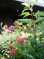
Chelsea Flower Show it is not. Be prepared to be ravished by something entirely different. It was designed by the Dutch landscape artist Piet Oudolf and the first impression is of grasses and wild-looking plants which might or might not be second cousins to Queen Anne's Lace or Grannie's Bonnet.You begin to notice the array of colours - mostly greens - and the shapes, the pattern of shadows, the stirring of leaves in the breeze, even the birds and the bees.

Peter Zumthor says 'Plants have long been part of the earth's history...Their beauty is deep and beyond question...I look at my garden and I see vibrancy, opulence, serenity, . I see dignity, playfulness, infinite tenderness, the 'nodding kindness' of Herb Robert and in the larger, beautiful picture, I discover small modest dots of colour that enhance the luxurious whole.'

 'Make of it what you like", says Zumthor.'There is no hidden, or even obvious, meaning here. This is a place for you to be. To be. Nothing else."  The third century saint Irenaeus said something like  'The glory of God is to be fully human'. This pavilion demonstrates how architecture can create spaces to help us contemplate our place in the world. It's a calming and joyful and beautiful place to rest and think.

I suspect St Iraneus would have loved it.


serpentinegallery.org
 guardian.co.uk/artanddesign/2011/jun/27/serpentine-gallery-peter-zumthor-garden
telegraph.co.uk/culture/art/architecture/8602611/Peter-Zumthor
Kieran Long, Evening Standard, 28 Jume 2011

For a very different view to mine see:.  independent.co.uk/arts-entertainment/architecture/serpentine-pavilion

Saturday 2 July 2011

86. PORTRAIT OF MY FATHER by TOMAS GEORGESON

Oil onboard  230 X 300mm
NATIONAL PORTRAIT GALLERY  2.7.11

This portrait does two things: it shows us what riches can be achieved by taking us this close to another person, while paradoxically reminding us that human beings are ‘other’,  and are gloriously unknowable.


At first sight it appears to be a simple record of a moment of unrehearsed, unscripted real life. In the family home. So, why not whip out a camera and take a photo instead? After all that’s what cameras are good at – intimacy, the immediacy of an impromptu decision and the poignant documentation of a moment forever lost.

Instead Georgeson uses a classic medium and style to make what he describes as ‘the most honest, intimate statement possible about my father’. What moves me about this painting is that Georgeson has set himself this challenge: it is as much a painting about a relationship as about a person. It’s about an intimacy which is both rooted in the past and welcoming the future. 
 
Georgeson makes it even more difficult for himself by painting a sleeping figure. If a face is ‘a window on the soul’, perhaps a face at rest is a window with the blinds down?  A face ‘at play’, as it were, can capture  expressions and nuances which tease the viewer into making assumptions about the character of the sitter. But here we have a blank. And what about eyes? They’re often used to draw the viewer into the picture. There are no eyes here and the viewer will still play tricks: one sees a wrinkle as a sign of wisdom, another interprets it as pure dissipation.

I like the warmth of the reds and earthy colours;  the trust of the sitter who allows us to see him in less than heroic pose; the unpretentious yellow Retro lampshade which sheds warm light on the subject’s face, on his limp hands and on the solid polished wood of the sideboard. Although the viewer is standing close enough to reach out and touch one of those hands to wake him, it is not claustrophobic.  There’s a pale door with glass panels onto the outside world behind the chair.

The artist has been making drawings and paintings of his father ever since deciding to become an artist fifteen years ago. He paints his uncle too, the British actor, Tomas Georgeson. This intimacy and warmth between sitter and artist is not sentimentalised. It’s almost raw The painter has used his access to a living breathing human being to pay attention to the sitter’s otherness. Quakers have a verbal equivalent: their practice known as ‘active listening’ means paying attention to another person. To do that we have to switch off the chatter in our own heads where we rehearse what to say next and resist the temptation to wait impatiently for the moment when we can interrupt.

The artist Giacometti, who spent long hours working on portraits of his wife and brother, would understand:  
. the great adventure is to see something unknown appear each day in the same face
 
This work is not like a lot of portraits which carry the hint of a story: the ruler high above our heads on his mighty steed, the artist with her brush and palette, the couple posed against a wedge of English countryside which they happen to own.  In this BP Portrait Award 2011 exhibition Wendy Elia’s portrait, for example, (blog number 84) has a  scatter of clues – the young man coming into the room with his hand over his eyes, the black tape on the armchair. But there’s little to divert us in this work 


thepaintedact.com
npgprints.com/image/697677/portrait-of-my-father-by-tomas-georgeson
Reading Faces, Sebastian Smee PROSPECT  May 2004