Friday, 28 June 2013

232. THE UNCERTAIN TIME by JOHN DEVENE

232. THE UNCERTAIN TIME by JOHN DEVANE

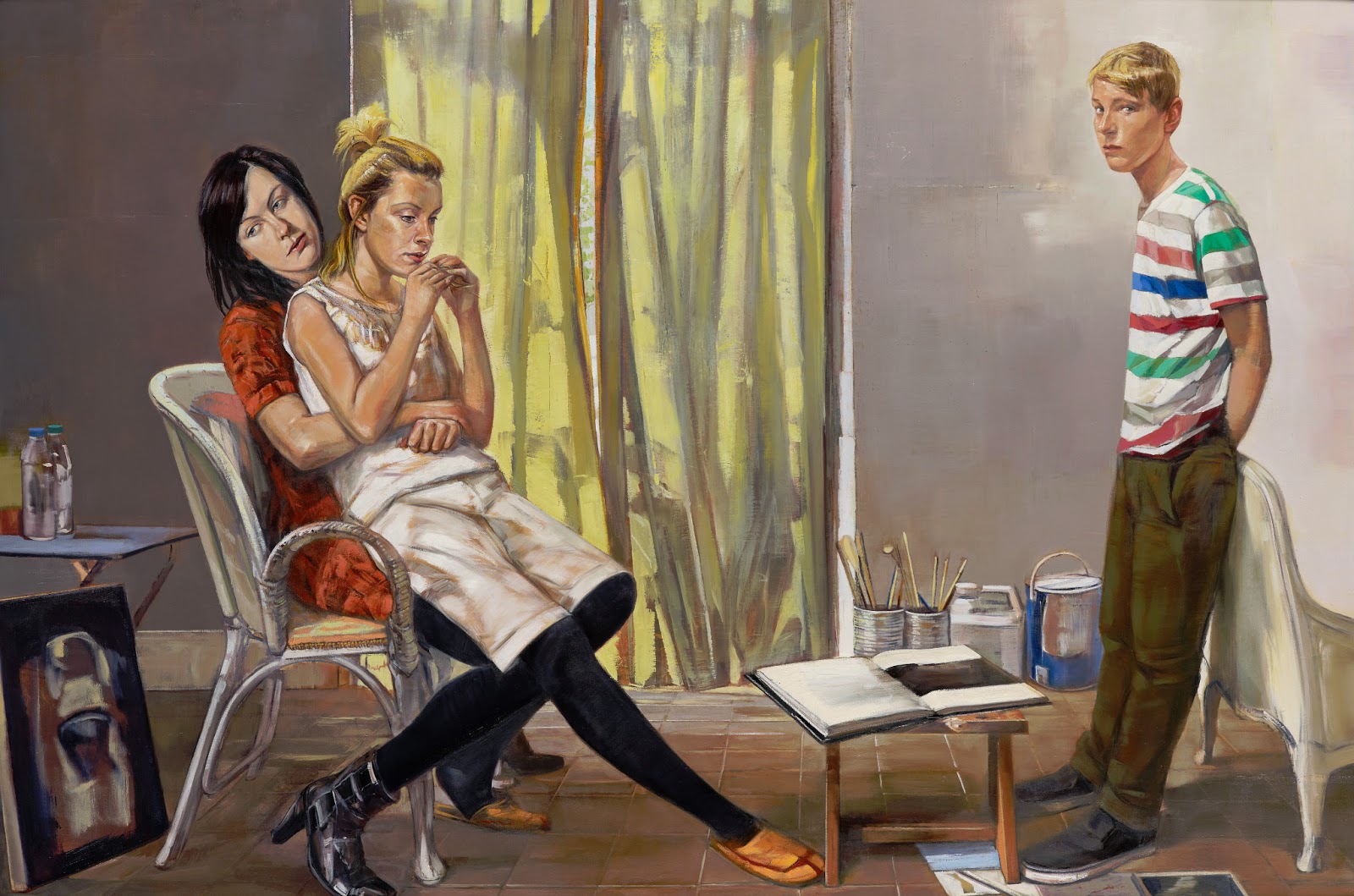
The Uncertain Time by John Devane © John Devane  Oil on canvas  1720 x 2490 mm

The immensely enjoyable annual BP Portrait Award Exhibition is open at the National Portrait Gallery until September 15th. This year there were nearly 2,000 entries from 77 countries.  John Devane, a painter who also teaches at Coventry University, was awarded the Second Prize of £10,000 for The Uncertain Time.

 As I walked around the 55 exhibited works, I noticed that while my attention usually went straight to the figure or faces portrayed, in this work the first thing I 'saw' was the central space. The title backs me up: this painting is about invisible time, space and atmosphere every bit as much as a depiction of Devane's three children: Lucy, Laura and Louis. 

It is a large canvas painted over three years, giving us a glimpse of  how children emerge from childhood and begin to assert their independence, gradually revealing something of their adult selves. Louis looks out of the picture at us, wary, perhaps confronting our intrusion. His sisters are uninterested in our presence, distracted perhaps by their own thoughts, physically close and supportive. The artist says: ‘The composition suggests an almost stage-like shallow space constructed in two zones with the three figures presented as if they are awaiting some kind of event’. 

In the BBC link below there's a slide show of a dozen of Devane's paintings including another group portrait, this time a military scene. It's from the Military Compound, Episkopi, Cyprus series which is held at the Imperial War Museum, another place to see free art. The IWM plans to re-open after refurbishment on July 29.  

The BP Portrait Award Exhibition will be at Aberdeen Art Gallery from 2 November 2013 to 1 February 2014 and at Wolverhampton Art Gallery from 3 March 2014 to 14 June 2014.

npg.org.uk
www.guardian.co.uk/artanddesign/2013/apr/23/two-studies-family-bp-portrait-award
www.bbc.co.uk/arts/yourpaintings/paintings/search/painted_by/john-devane
www.iwm.org.uk/visits/iwm-london/about

Thursday, 27 June 2013

231. TOTAL STRANGER by GILLIAN WEARING


 84 x 52-5cm Limited Edition Poster
This is another recently-commissioned poster from the series of 15 commemorating the Tube's 150th anniversary. I saw this at Southwark station but they should all be at St James Park, Gloucester Road and maybe London Bridge station. Here's the story behind this particular picture. 

Olivia Wilson, the subject, writes:

'On the day I met up with someone from TfL (Transport for London) and we got on a District line train, Eastbound and when we got to Bow, Gillian Wearing got on. She didn’t talk to me she just took pictures as it was meant to be an encounter of strangers'.

Gillian Wearing writes:

'The Tube is full of strangers. We acknowledge this fact, knowing that we too are strangers to others. My project is to photograph a stranger. The person came forward via an open call advertised in the Metro newspaper and on the TfL website. I chose them through a raffle­ticket system, which did not reveal their name, age or gender. Until we met on a train and I took her photograph, I still didn’t know her identity, and she didn't know who I was either. For a brief moment, we were total strangers to each other'.

The result is intriguing. The subject looks wary yet composed, with a hint of the British tradition of ladies' portraits as displayed in galleries up and down the country.  By good fortune she (and her carrier bag) are sporting gentle but warm colours which are a perfect foil to the medley of blues and green in the carriage and the world outside. Although we know it cannot be, it feels as though she is sitting alone in an empty carriage, which summons up a faint tremor of vulnerability

Gillian Wearing is primarily a video and photographic artist, who won the Turner Prize in 1997. Her art is distinctive and memorable - she explores the disparities between private and public life by taking everyday circumstances all of us have encountered and suggesting new ways of reflecting both on established behaviour and what people do on impulse.
60 Minutes Silence 1996

One example is 60 Minutes Silence which looks like a life size photo of 26 police officers, but as the minutes pass the strain builds up. The men and women shuffle and flex - you realise it's a video of an hour of silence and stillness. The longer you look, the more individuality and humanity emerge. It's mesmerising. When told  'Time's up' one officer let out a yelp of relief you could hear all over the gallery.The art critic Richard Dorment commented in the Daily Telegraph 'The moment is like a dam bursting. His final cathartic joyful cry is one of the great moments in the history of recent art'.

 I use the Underground most days and love it; on the whole passengers do not make eye contact. But this young woman is breaking the rules. She looks straight into our eyes. She is present. She is attentive. She is a secret. 

www.Art-Underground-Artists-brighten-Tube-abstracts-portraits
www.maureenpaley.com/artists/gillian-wearing
www.dailymail.co.uk/news/article-2342204
www.capel.ac.uk/news/budding-capel-florist-is-face-of-the-london-tube.html


Tuesday, 25 June 2013

230. I CAME BY TUBE by GOSHKA MACUGA

15 for 150: Posters in the Tube Southwark Underground Station

I Came By Tube     52 x 146 cm
A young woman, beautiful and mysterious. We are looking at her but she is paying us no attention. We cannot tell what is holding her gaze. The sepia photograph, the retro make up and hairstyle, and the crook of her arm suggest another age. She's in a puzzling setting too - she sits on a sawn-off tree trunk, an unlikely spot for a nymph in sylvan woods or a model posing while her beautiful body is being transfomed into white  marble.  Most surprising of all, she protects her modesty with maps of the London underground.

Goshka Macuga is a Polish-born London artist and runner up for the Turner prize in 2008.   I Came By Tube is one of 15 posters by leading contemporary artists commissioned to mark the 150th anniversary of London Underground.

   Macuga has a particular gift for playfully exploring the history of art and the history of art institutions, often using collage and found objects. Here she has chosen the map made in 1931 in his spare time by a railway employee called Harry Beck (for which he was paid 10 guineas). It's the first  diagrammatic map of London's  Underground. He realized that the physical locations of the stations above ground were irrelevant to the traveller wanting to know how to get to one station from another. It was a huge success and the idea has been copied world wide.

Macuga's decision to display it on the body of a beautiful young woman disrupts our expectations. As does her earlier Cave 1999, when she borrowed work from her artist friends and set them in a 'grotto' made of crumpled brown paper, citing the prehistoric cave  as the first museum/gallery. She is particularly interested in the history of advertising and its relation to women. Is she suggestng that we look afresh at the way women's bodies are used in advertising each and every product?


Beck's map inspired Simon Patterson's The Great Bear (1992), to be found in Tate Britain. In this witty and  memorable work he reproduced the map and replaced the names of the underground stations with the names of engineers, philosophers, explorers, planets, journalists, footballers, musicians, film actors, saints, Italian artists, comedians and kings.

P.S.The publicity says that the posters are on view at London Bridge, Southwark, St James' park and Gloucester Rd tube stations. But I searched in vain at London Bridge and not even a staff member who consulted a staff member who consulted the Supervisor knew of them. But you can see them in all their glory at Southwark station - and maybe at the other stations too.

PPS. Each artist has created a special signed and numbered edition of the prints, now on sale.
www.saatchigallery.com/artists/goshka_macuga.htm
http://art.tfl.gov.uk/projects/detail/11822/

www.creativereview.co.uk/cr-blog/2013/february/poster-art-150 


Sunday, 9 June 2013

229. WHAT DOES THE VESSEL CONTAIN, THAT THE RIVER DOES NOT by SUBODH GUPTA

(c) artist Mixed media
Approx. 21.35 m long, 3.15 m wide, 110 cm deep


HAUSER & WIRTH, 23 Saville Row 
until July 27

 What does the vat contain that is not in the river?
What does the room encompass that is not in the city?

This world is the vat, and the heart the running stream,

this world the room, and the heart the city of wonders.
(From The Sufi Path of Love  by the 13C Persian poet  Jalāl ad-Dīn Muhammad Rūmī)


What is a traditional fishing boat from Kerala , India -  measuring over 20 metres - doing straddling the length of the gallery? It looks a bit tipsy, unstable. Stormy weather out there. Lying on the ground it would have been beached, defeated.
(c) the artist.
Subodh Gupta remarks that it's crammed with 'one person's entire essence': cooking pots and pans, chairs, beds, an old radio suitcases, fishing nets and on old bicycle.It reminds me of Song Dong's Waste Not Want Not (Blog 150), a collection of over 10,000 used household objects displayed on the floor of the Barbican. But that was a means of enabling artefacts to provide the viewer with a family narrative: memories made flesh, even turned into a snapshot of Chinese history.

Here the link with the poet Rumi  marks the idea of microcosm: an entire universe contained within a human soul. The boat is no mere piece of transport for getting you from one place to another. The contents are crammed and pushed together, bound with ropes. For the moment they lie there useless. They have come from somewhere and are on the move. They remind us of sustenance, livelihood, even survival.

This artwork is placed in one of the most expensive and glamorous parts of London. It reminds me of the magic of freighters described in a very different poem  which tens of thousands of British school children learnt by heart decades ago.There's even a reference to cheap tin trays.

CARGOES by John Masefield
VERSE 1
Quinquireme of Nineveh from distant Ophir,
Rowing home to haven in sunny Palestine,
With a cargo of ivory,
And apes and peacocks,
Sandalwood, cedarwood, and sweet white wine.


VERSE 3 
Dirty British coaster with a salt-caked smoke stack,
Butting through the Channel in the mad March days,
With a cargo of Tyne coal,
Road-rails, pig-lead,
Firewood, iron-ware, and cheap tin trays.


hauserwirth.com
www.hauserwirth.com/artists/11/subodh-gupta/
allpoetry.com/poem/8495911-Cargoes-by-John_Masefield 
www.barbican.org.uk/artgallery 

Friday, 17 May 2013

228 ROCK ON TOP OF ANOTHER ROCK by PETER FISCHLI and DAVID REISS

228. ROCK ON TOP OF ANOTHER ROCK by PETER FISCHLI and DAVID REISS
Walking past  trim railings and flanked by tidy grass, you are shepherded  along Kensington Gardens' neat paths. And then you come across 2  gigantic boulders approximately 5.5 metres high, which seem to be balanced on top of one another. The title tells you nothing. It is what it is. Not a word about construction and destruction, oscillation and stability.

You touch or stroke the work. It is pitted and veined and awesome: some granite is said to be more than 4 billion years old. Compare that with most art, often made of contemporary materials; some may even last a few fleeting seconds. The Swiss artists Peter Fischli and David Weiss are known for their witty sense of the absurd and their power to startle us into taking a fresh look at our surroundings with art which feels both incongruous and commonplace. 

For we have one of these already - Logan Rock at Treen, the bay next to Porthcurno, of Minack Theatre fame. It's balanced on the top of of one of the pinnacles of this promontory. It's much loved. In the 19C a gang of macho soldiers led by a nephew of the playwright Oliver Goldsmith managed to dislodge it and was made to put it back asap at considerable expense.

Rock On Top Of Another Rock is the first UK commission for the artists and is organised by the Serpentine Gallery, The Royal Parks and Modus Operandi. It currently serves a particular purpose. The Serpentine Gallery is closed for refurbishment until June 8, when the Pavilion designed by Sou Fujimoto opens. When a loved institution is closed for refurbishment, it's impossible to spread the news world wide among all intending visitors. (As families and groups alighting at Lambeth North tube station in the hope of visiting the Imperial War Museum  are currently finding (reopens 29 July)). Rock On Top Of Another Rock, situated close to the entrance to the gallery, gives a focus.

If you like the artists' zany sense of humour, one of  their best known works is the short film The Way Things Go (Der Lauf Der Dinge). It's about chain reactions and the astonishing way objects fly, crash and explode across a studio. Intriguing and fun for all ages..


Tuesday, 14 May 2013

227 MUHLBERG by ELKE COUNSELL

.A SPOT OF RED at the  MENIER GALLERY
by the ESPACIO ARTISTS
a London-based group of artists with cultural links around the world.
Elke Counsell says of her work 'those who see my paintings can have their own ideas as to how a picture could develop'. She aims at 'the not-quite-finished look'. 

The orchard in the foreground seems to shimmer in the light. Perhaps the weather is warm, wet and blowy? The soft pastel colours melt into one another but they are studded with a fiery red. On the hills not one but two substantial buildings are watchful;  ancient stories of love, separation, generosity and compromise are wrapped round them.

The artist was born in Berlin in 1939 and life was not straightforward. She lived for a time in the village of Muhlberg and played in this orchard. Muhlberg is next to Wechmar, a village notable for being the home of the Bach family of musicians and composers.

The work above is an expression of a new kind of personal  exploration, for having worked as a translator, she is now a very successful illustrator of children's books (one of my favourites is Springy Jane written by Alexander McCall Smith).Below are some examples of her witty and delightful work.

www.espaciogallery.com/elke-counsell.html

www.espaciogallery.com/a-spot-of-red.html
www.amazon.co.uk/Maximus-Has-Bad-Mouse-Books/dp/1859990576

Friday, 10 May 2013

226. UNTITLED by ALEXIS VAN EL


Crimson, scarlet, vermillion. Red has many names.
Blood, lipstick, earth, mars. Red has many meanings.
Of all the primary colours, is red the most powerful, disturbing and divisive?


In this show Espacio artists, a  London- based group with cultural roots around the world explore the potential of red to evoke a visceral reaction in the viewer. But is this the only use for red? Or can it have other meanings, other possibilities?

The triptych here on display stands on a window sill at the Menier Gallery. The image cannot do justice to Alexis van El’s work, which is designed to be seen from more than one viewpoint, with the additional pleasure of looking through the startling gap slashed through a beautifully textured metal surface. It’s pungently reminiscent of the scars you see where branches have been lopped off mature trees leaving a gaping wound. 

The metal plaques are made of thin, mild steel sheet, sometimes with the addition of other metals, mainly copper. Some are suspended in pairs in a Perspex frame; others, called Bookforms, consist of two hinged plates, conjuring up the enclosed, personal world a reader is free to enter.   


 And for most of us that beautiful shape has sexual associations. The artist writes ‘in my pieces the labial forms and the enriched, encrusted surfaces celebrate female energy’.

In 1928 Virginia Woolf addressed the Arts Society at Newnham College, Cambridge on the subject of Women and Fiction, and from this talk emerged her feminist and modernist text, A Room of One's Own. In March of this year, as part of Women's History Month, Alexis van El was one of 12 artists at the Espacia Gallery offering their personal response to the work. Woolf writes about women and education, marriage, money and property, and ends with a passionate call to her readers to open their minds and throw themselves into creative endeavour. (Woolf was practical too, recognising in the book title that ‘a room of one's own and money in one's pocket’ are essential to women's creative freedom).